If you insert a disk into a Mac with Parallels Workstation running, it often thinks the CD or DVD was meant for it, and then the disk doesn't appear on your Mac desktop. To make Parallels give the disk up, go to Devices > CD/DVD-ROM and then choose Disconnect. The disk will quickly appear on your Mac desktop.
The reverse is also true. If the Mac desktop was active when you selected the disk, your Windows machines under Parallels won't see the disk. Go to Devices > CD/DVD-ROM and then choose Connect, and presto changeo, there it is.
Tuesday, May 30, 2006
Tuesday, May 23, 2006
Testing Web Pages for Mobile Devices and Handhelds
All I can say is Thank God for Parallel WorkStations... it turns out that most handheld device simulators only work on Windows. But I'm starting at the end.
Suppose you want to look at your Web site with a mobile device. First, I suggest pulling out your telephone. Most telephones these days do support XHTML (and also HTML, though they don't admit it readily) and CSS. WML is on the decline.
Once you've gotten over the shock of seeing your page shoehorned into that tiny telephone screen (well, mine's tiny anyway), you might want to see it in other handheld browsers. There are lots and lots but here are some links to get you started.
Openwave's handheld browser, according to Wikipedia, "has shipped on over one billion handsets, approx 49% of the global browser-capable device shipments". That's a lot of phones. Openwave's simulator is the easiest to get up and running. You can find it at developer.openwave.com. It only runs on Windows. You can type your URL in the Go box and hit enter to go there instead of plodding along with the number keys. (It's a good idea to know how much of a pain it is to get to certain sites, but when you're testing, you only really need to do that a few times before you get the message loud and clear.)
Nokia's phone simulators are a pain to install, because there are lots of bits and pieces, including the Nokia Mobile Gateway (NMG), Nokia Mobile Browser Simulator, Nokia Update Manager, Nokia Connectivity Framework, and Nokia Mobile Internet Toolkit (NMIT). You can find them all at www.forum.nokia.com. Nokia's stuff only works on Windows as well... and they demand a zillion-digit serial code number (free, thankfully) that I had to transfer laboriously for each of the components from my other Mac where my email is... Ugh!
The easiest software to use is that from Opera (www.opera.com). It turns out that Opera is one of the leading developers of mobile browsers. To facilitate testing Web sites for mobile devices they have a clever option on their desktop browsers. Choose View > Small Screen from a desktop version of Opera and it will show you what its Mobile Opera would show.
And what would it show? Well, if you haven't created a handheld style sheet for your Web page, it will adapt your site on the fly for the small screen. If you have created (and linked) a handheld style sheet for your Web page, it will use that.
Opera's new Mini mobile software is pretty cool too. I was able to download it to my very average telephone (whose model number eludes me) and it's pretty good at adapting pages to my weeny screen. You can emulate the Mini mobile software with a Java application that Opera has published on the Web. It is tiresome to type with number keys! Click the hash symbol (#) to get to the lowercase letters--otherwise you'll never get to your site (unless, it too is in all caps). Since I haven't figured out how to backspace, I'm very careful not to make any typos... if you know, drop me a line! I did figure out how to Refresh the Opera Mini simulator... when you've finally gotten to your Web site, click the Menu button (top left) and then use the arrow buttons to get down to Tools, and then choose Reload. Yee-ha!
I also admit to creating entry pages with very short names in the top level of my domain with links to the pages I'm testing. I just can't be bothered to push that many number keys!
Wednesday, May 10, 2006
Updating Firefox's Live Bookmarks
If you're creating a new XML feed for your web site (which I'll explain in the new edition of my HTML book), you'll want to check that the new feed is working properly. You can go to the site in Firefox, click the orange RSS icon
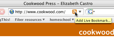
to add the feed to your bookmarks toolbar:
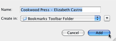
Then test the Live Bookmark by choosing it from the Bookmarks Toolbar:
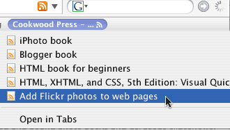
OK, so far so good. But once you change the XML feed, how do you get Firefox to update the bookmark? I found a rather complicated way to change Firefox's refresh rate, through the about:config page (and the "browser.bookmarks.livemark_refresh_seconds" preference, but it didn't seem to work very well.
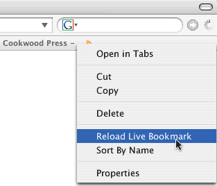
The easiest way was hidden in the contextual menu: right-click the live bookmark and then choose Reload Live Bookmark
I'm the kind of person who forgets this as soon as I don't need it anymore (like when I've finished updating the XML feed). I post this here in the hope that I'll be able to quickly find this information the next time I am testing my XML feed... or for the next time you are testing your XML feed.
(Another option for updating live bookmarks is to quit Firefox and restart.)

to add the feed to your bookmarks toolbar:

Then test the Live Bookmark by choosing it from the Bookmarks Toolbar:

OK, so far so good. But once you change the XML feed, how do you get Firefox to update the bookmark? I found a rather complicated way to change Firefox's refresh rate, through the about:config page (and the "browser.bookmarks.livemark_refresh_seconds" preference, but it didn't seem to work very well.
The easiest way was hidden in the contextual menu: right-click the live bookmark and then choose Reload Live Bookmark

I'm the kind of person who forgets this as soon as I don't need it anymore (like when I've finished updating the XML feed). I post this here in the hope that I'll be able to quickly find this information the next time I am testing my XML feed... or for the next time you are testing your XML feed.
(Another option for updating live bookmarks is to quit Firefox and restart.)
Wednesday, May 03, 2006
Add Flickr photos to web pages
When you go to see your Flickr photos, the address is up in the Address bar as usual. This address won't work as the source for an img tag, however. Instead, select the photo, and then click the All Sizes button up above the image.
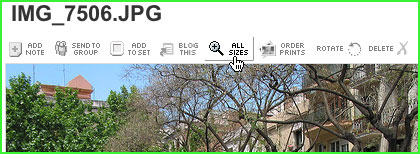
Then choose the size you'd like to have appear on your web page. It will appear in the new window. Below the image you'll find the URL of the image itself as well as a premade chunk of HTML code for the image linked to its home on Flickr.
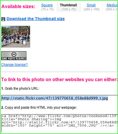
I dunno, maybe this is obvious, but I couldn't remember where it was and it took me a few minutes to find it again.

Then choose the size you'd like to have appear on your web page. It will appear in the new window. Below the image you'll find the URL of the image itself as well as a premade chunk of HTML code for the image linked to its home on Flickr.

I dunno, maybe this is obvious, but I couldn't remember where it was and it took me a few minutes to find it again.
Monday, May 01, 2006
Pixels, Font Size, and Internet Explorer
I've been fussing with Internet Explorer* 7 beta and trying to figure out why it matters that IE won't resize pixel-sized elements and how this affects using relative font sizing in CSS.
Let's recap. If you set a relative font size, it has to be relative to something. Indeed, a font size set in ems or percentages is calculated with respect to the element's parent. So, a p element set to 100% would be 100% of its parent, which is usually the body.
What is the size of the body? If none has been set, the browser uses its default--usually 16 pixels (though Firefox lets users adjust this value). If a relative size has been set, it is calculated with respect to this default and then this number is used to find the size of the p and any other descendants.
The tricky part comes when visitors use the Text Size option (called Text Increase in Firefox). What an average visitor might expect, and what happens in Firefox and others, is that when they choose a new Text Size, the size of all the text in the Web page changes in proportion to their original sizes.
But in Internet Explorer, the Text Size option seems to affect only the default size of the body element, and any other elements that are relative to the body. Any element whose font size is set to a fixed size (e.g., in pixels) is not changed when a visitor chooses a new setting for Text Size. This kind of makes sense. If the designer sets a pixel size for an element, why should changing the default size of the body have any effect on it?
But there's one very weird thing. If you set a pixel size for the body, thinking that you can then have control over all the elements contained in that body, for some reason Internet Explorer decides that header elements are not children of the body element and do not inherit its size. This has a further consequence: when the visitor uses the Text Size option, the headers grow and shrink but other elements, like p (rightly treated as children of body), do not.
No matter that h1 and p are both children of body.
One more point. If you decide to set a pixel size for the body and then give the header elements a relative size, all of a sudden Internet Explorer recognizes the parent-child relationship between the body and the header and immediately applies the calculation (and stops affecting headers with the Text Size option).
It's just not quite right.
The solution is probably to continue to follow Owen Briggs' proposal to use both percentages and ems to size text.
(*Note, Internet Explorer's unwillingness to resize pixel-specified font sizes is not peculiar to version 7. Earlier versions have the same characteristic.)
Subscribe to:
Comments (Atom)
