 If you viewed my other blog last week, you would have seen a rather unwieldy, definitely endless list of labels like the one shown at left. Labels are Blogger's way of helping you categorize your blog posts so that readers can jump to an entire set of posts of interest. However, as the list gets longer, and disappears off the bottom of the screen, it also gets a lot less useful.
Of course, the first problem is that it's not easy to label your posts effectively in the heat of the moment. For example, I have a number of labels for the individual animals on our farm, where really it would probably be a lot more useful to have a single "animals" label. You can go back and edit your labels either at the Dashboard or by editing individual posts. I'll leave that up to you.
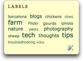
Blogger, for its 10th anniversary, has been rolling out some lovely new features, including the ability to display a cloud of labels. This means that your labels will be shown in various sizes, depending on how often you've used them. It gives your readers a clear, visual way to see which topics you visit most often on your blog--and which topics you visit only occasionally.
And since the label cloud is formatted not as a list but as a short
paragraph, it takes up a lot less space and is much more aesthetically pleasing. Let's get to it.
If you're logged into Blogger and viewing your blog, you can just click on the Edit icon at the bottom of your list.

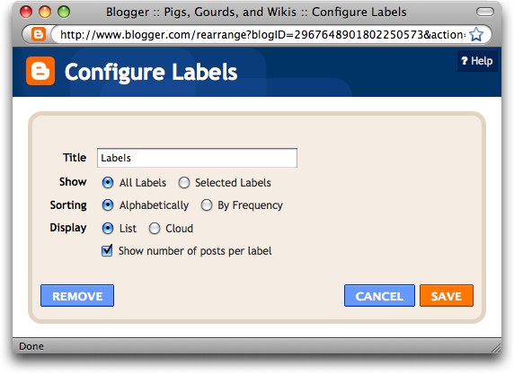
Or, if you're at the Dashboard, click Layout, and then click Edit next to the Labels gadget. (If you haven't added the Labels gadget yet, then click Add a Gadget on the Layout | Page Elements page and choose Labels from the list that appears.) Either way, you'll see the Configure Labels box:

By default, all the labels you've used for your posts are displayed alphabetically in list format, one to a line, with the number of posts belonging to each label appended to the end of the line.
Thanks to Blogger's birthday, you now have more options.
Let's start at the top. Instead of editing my labels in the posts themselves—perhaps I want to maintain my fine-grained approach—I can decide not to display all of them in my new cloud (or in lists for that matter).
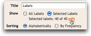
Click Selected Labels at the top of the Configure Labels box. A small edit button will appear:

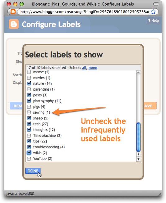
Now click the edit button to see your list of labels and to choose which ones should appear in your cloud. Click Done when you're finished.

The next line in the Configure Labels box determines whether labels are listed alphabetically or by frequency. Since a cloud of labels already uses font size to show frequency, I think it makes more sense to leave this as Alphabetically. (If you use Frequency, you'll see a smaller to larger list of labels instead of a mixed one.)

Finally we get to the Display line. Be sure and choose Cloud!
And once again, since the frequency is displayed using the font size of the labels, you don't really need to show the number of posts for each label. Deselect that option.

Then click Save and view the lovely results. This is much more useful than that endless list we started with!


No comments:
Post a Comment